Gold IRA Master brand kit
The Gold IRA Master brand kit defines the visual language for company evidence, practical education and financial tools. Consistent typography, amber accents and structured cards help readers find the decision and the next useful action.
Keep the identity consistent across page types
The Milled Coin mark accompanies the Gold IRA Master wordmark. Plus Jakarta Sans supplies headings and interface emphasis, while Instrument Sans carries body copy. Warm paper and ink keep long explanations readable; amber identifies selected states and a small number of focal points.
Colour communicates hierarchy rather than creating a different theme for every topic. Use the same card surfaces and borders on a company review, a guide and a calculator so the reader can recognize the type of interaction before reading its details.
--bg--surface--ink--muted--line--accent-2--soft--eyebrowBuild the page around its job
The bento head introduces a page’s question, an engraving and a concise decision prompt. Article sections carry the argument and sources, with navigation alongside longer text. Directory cards identify destinations through their linked keywords, not by turning every block into a competing action.
Calculators use the same form and result components, with the working input near the beginning. Labels identify units and the result states the assumptions. The calculator library shows those functional patterns in context.
Use illustration and motion to support the content
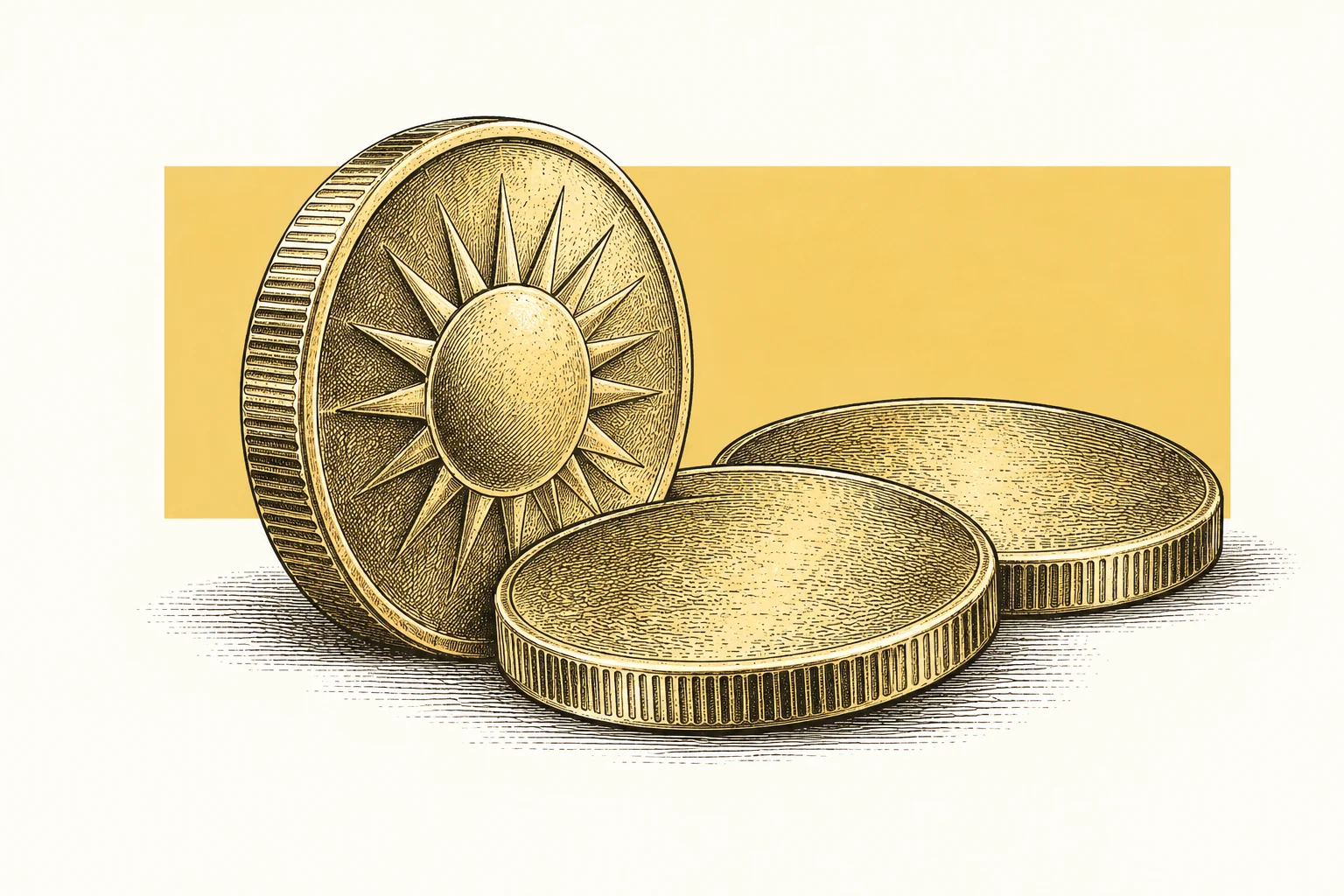
Engraved plates share an ivory and saffron treatment. Their subject matches the page’s decision: fees, storage, retirement funding or due diligence. The plate remains separate from the text, with no text layered over the illustration.
Subtle reveals help the reader move through related blocks. Reduced-motion settings show the content without requiring animation, and the content remains visible if the enhancement fails. Source evidence and functional controls remain the priority.
Frequently asked questions
Should every page use a new layout?
No. Reuse the established component family while matching the section structure to the reader’s task. Company reviews, explanatory articles and working calculators have different content needs, but their typography, controls, surfaces and spacing should feel like the same site.
Can illustrations establish a provider’s service quality?
No. An engraving supports the subject and visual identity; it is not evidence that a company owns the depicted assets, facility or equipment. Provider claims still require their own sources. Real source screenshots should be presented as source material rather than invented operational proof.
Should motion hide information from reduced-motion users?
No. Motion is an enhancement, not a condition for reading the page. Users who request reduced motion should see the complete content, and failures in animation code should not prevent the page’s evidence, forms or navigation from being used.